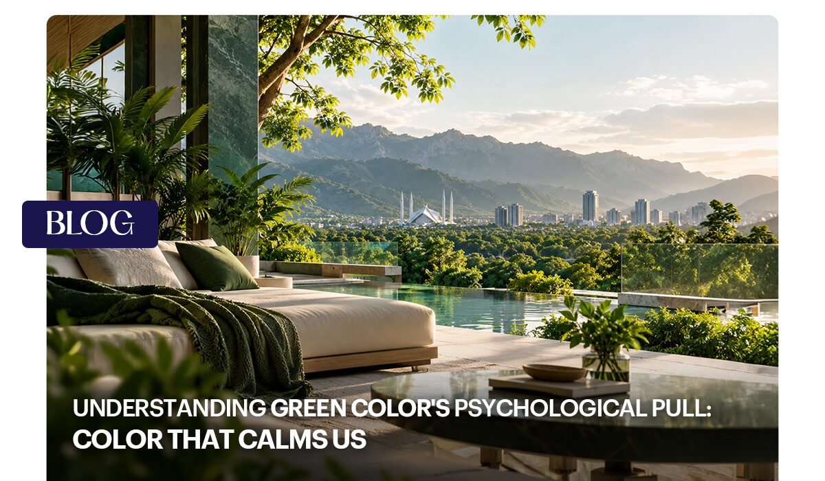

Colour psychology is the broader field that studies how hues shape mood, perception and decisions. It’s used in marketing, interior design, healthcare, education and art. Within that field, green colour psychology focuses on one of the most universally recognised colours.
Colour effects are real, but modest and context-dependent. A green wall will not cure anxiety, and no colour works the same for everyone. Culture, personal memories, the exact shade, lighting and even your mood before you walked in all shape your response.
A helpful way to think about it is in three layers:
- What green does to people in general. Most people find it restful.
- What green means in your culture. It could signal luck, money, religion or envy.
- What green means to you personally. Perhaps a grandparent’s garden or a favourite childhood hiding spot.
One commonly cited idea involves wavelength. Warm colours like red and orange have longer wavelengths and tend to feel energising. Shorter-wavelength colours such as green are generally considered “cool” and relaxing. It’s a useful rule of thumb, though not a law of nature.
Why Does Green Calm Us?
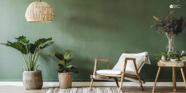
The most widely shared explanation within green colour psychology is our connection to nature. Studies suggest green triggers calmness and relaxation because it dominates nature. For most of human history, lush green surroundings meant reliable water, food and shelter. A brain shaped by that history may treat green as a cue that the environment is safe enough to relax in.
Environmental psychology adds a second idea: natural scenes may help restore attention after mental effort. A simpler explanation comes from the colour wheel. Green sits between calming blue and energetic yellow, so designers often describe it as both soothing and refreshing. It relaxes a space without making it feel sleepy.
Seeing the Colour vs. Being in Green Spaces
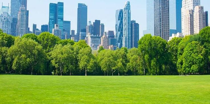
Many articles skip this distinction. Much of the strongest evidence for green colour psychology comes from exposure to green environments such as parks, forests, and gardens, rather than the pigment alone. Real plants bring movement, natural light, fresh air, birdsong and a break from screens, all of which help you unwind. A paint swatch gives you only the colour.
That doesn’t make green paint useless. It means the most effective approach combines both: green tones indoors plus real contact with greenery, whether through a window view, a balcony planter or a daily walk.
The Positive Associations of Green
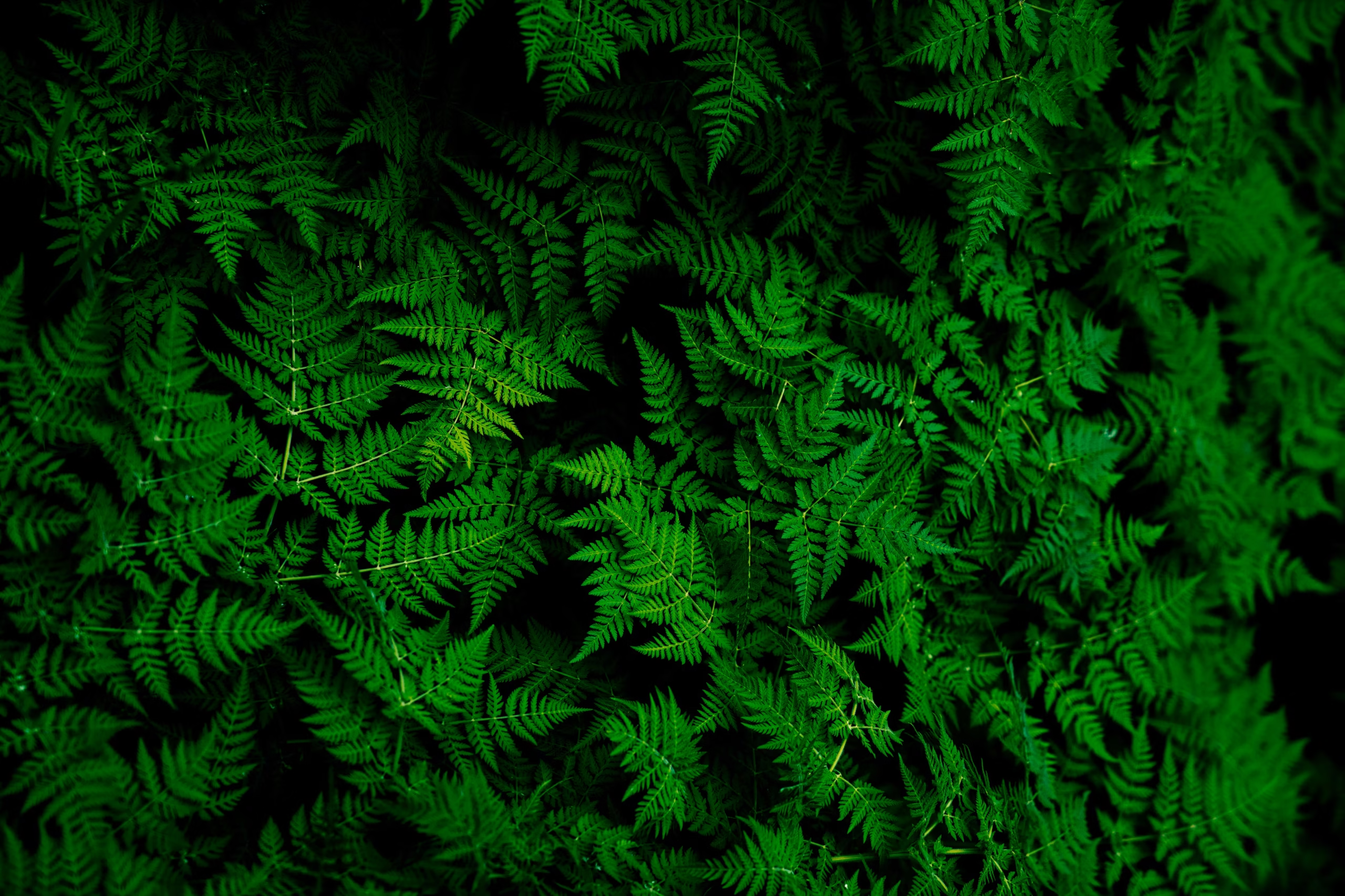
Beyond calm, green carries a cluster of positive meanings that reinforce one another. That’s another reason green colour psychology shows up in so many industries:
- Growth and renewal: new leaves, spring, fresh starts
- Health and freshness: vegetables, herbs, green tea, wellness brands
- Balance and harmony: a midpoint between warm and cool colours
- Money and prosperity: “greenbacks” in the US and many financial brands
- Luck and permission: lucky charms and the “green light”
- Sustainability: environmental movements and eco-friendly products
Shades of Green and What They Mean
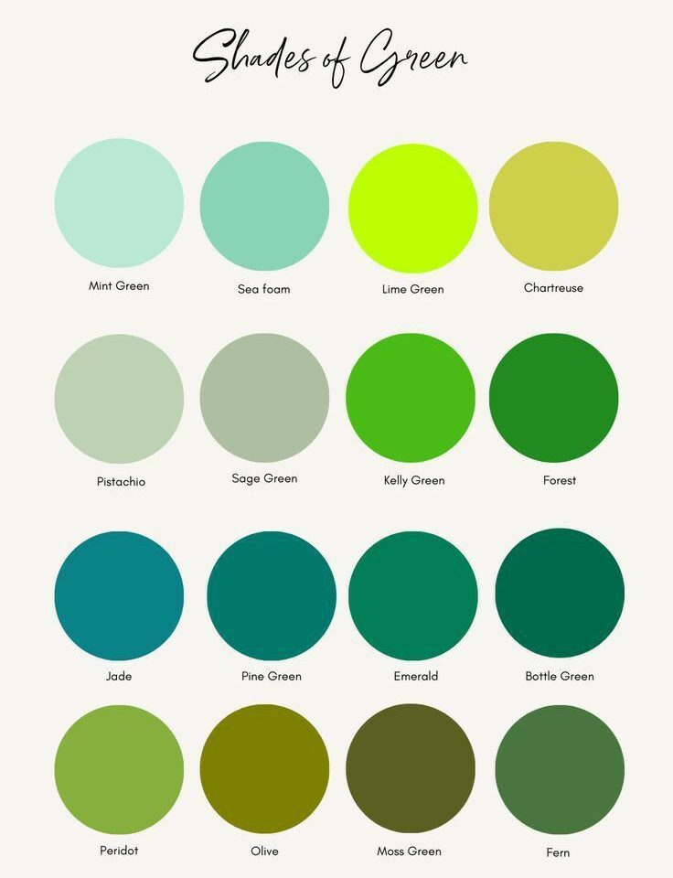
Not all greens behave the same way. Green colour psychology shifts noticeably from one shade to the next:
- Mint and pale green: fresh, gentle and airy. Lighter greens like mint and lime are tied to freshness, vitality and new beginnings. They suit bathrooms, kitchens and nurseries.
- Lime and bright green: playful, energetic and attention-grabbing. Best as an accent.
- Sage and muted green: soft, grounded and quietly sophisticated. Popular in bedrooms and living rooms because it calms without feeling stark.
- Olive: earthy and mature, with a slightly vintage feel. It pairs well with warm woods.
- Emerald: rich, confident and luxurious. A favourite in fashion and statement interiors.
- Forest and hunter green: dark greens suggest stability, wealth and tradition, which is why they appear in libraries, studies and financial branding.
- Teal and blue-green: cooler and tranquil, a bridge between green and blue.
There’s also a perceptual angle. One colour expert notes that we can distinguish more shades of green than any other colour, which may help explain why green environments feel visually rich rather than flat.
Green Across Cultures and Religions

Cultural context is part of green colour psychology too, and a global audience will read green differently:
- Western cultures: nature, luck, money and environmentalism, but also envy.
- Islamic cultures: green is considered the colour of paradise and is closely associated with the Prophet Muhammad. It appears in mosque decoration, flags and ceremonial garments, including Pakistan’s national flag.
- Japan: eternal life, youth and energy.
- China: health, prosperity and harmony, though a “green hat” carries a negative idiom about infidelity.
- Hinduism and Buddhism: balance and harmony, plus the heart chakra, tied to compassion and healing.
- Many African traditions: earth, agriculture, growth and prosperity.
If you design for an international audience, check what green means in each market before you commit to it.
How to Apply Green Colour Psychology in Everyday Life
Understanding the theory is useful, but the real value is in using it. Here’s how to put green to work.
At Home
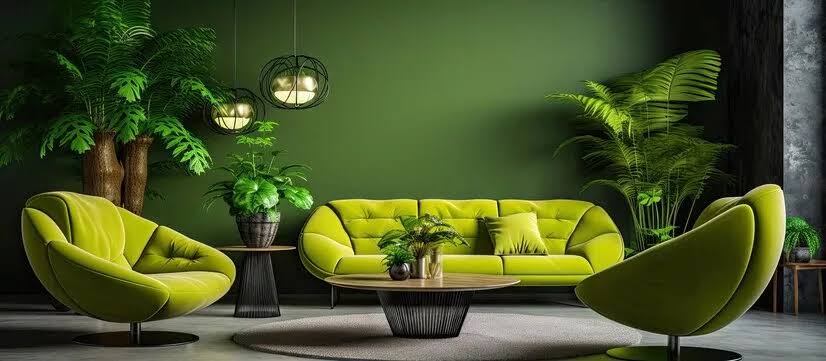
Using green colour psychology at home starts with matching the shade to the room’s purpose:
- Bedrooms: choose soft, muted greens like sage or grey-green to support rest.
- Living rooms: mid-tone greens create a relaxed, social feel. Pair with natural wood and linen.
- Home offices: green supports focus and reduces visual fatigue. Add real plants for the nature-exposure benefit.
- Kitchens and bathrooms: lighter, fresher greens feel clean and airy.
- Studies and libraries: deep forest green adds a cosy, enveloping mood.
Green pairs well with other colours too. Blues and yellows amplify its natural calm, while touches of pink or red add vibrancy.
In Branding and Marketing
Brands use green colour psychology to communicate health, nature, growth, or financial stability. Starbucks, Whole Foods, and many banks use it, each with a different shade to send a different message. A word of caution: consumers have become sensitive to “greenwashing,” so green branding works best when the product genuinely backs up the promise.
In Fashion and Personal Style
Green colour psychology also shapes how others perceive you. Forest and emerald green project confidence while staying approachable and trustworthy, which makes them useful in professional settings. Brighter greens feel lively and casual. Choosing a shade that complements your skin undertone helps too, since cooler undertones tend to suit blue-greens and warmer undertones suit olive and yellow-greens.
In Web and App Design
Digital designers also borrow green colour psychology because it already signals “success,” “go” and “approved” for most users. That’s why it’s common on confirmation messages, progress bars and checkout buttons. One accessibility caution applies: red-green colour blindness affects a meaningful share of users, so never rely on colour alone. Pair green with icons or text labels.
Green Colour Psychology and Urban Living: The Citadel One3 Example
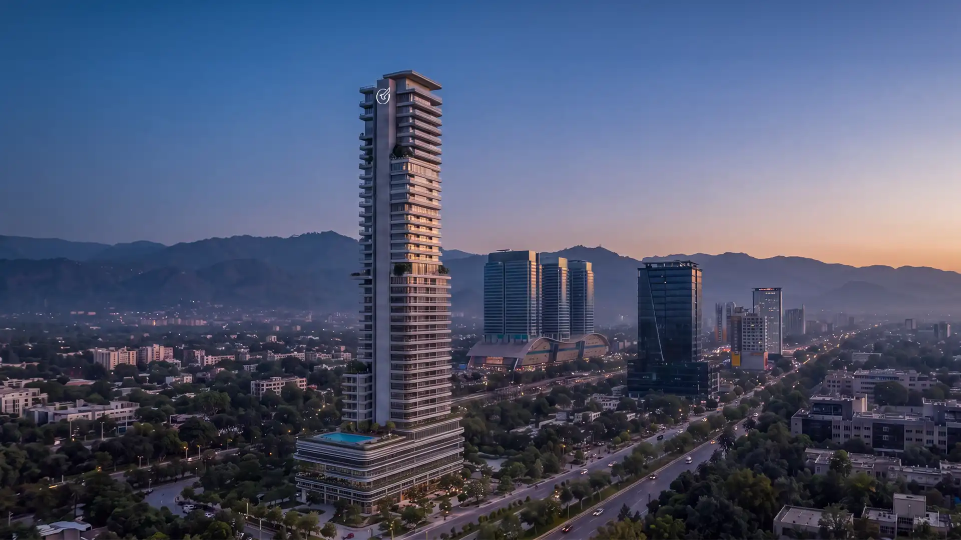
Green colour psychology and urban living might seem like an odd pairing, since cities are made of concrete, glass and steel. In practice, green’s calming effect is a major reason people value homes with views of trees, hills, and parks. That’s where Citadel One3 offers an interesting case study.
Citadel One3 is a condominium project by Chakor in Islamabad’s Blue Area. The project is planned as a 40+ story residential tower along Jinnah Avenue, with views of the Faisal Mosque and F-9 Park.
Here is where the connection to green colour psychology becomes concrete. Islamabad is known as one of South Asia’s greenest capitals, and the Margalla Hills form a green backdrop that many residents treasure. A tall residential tower with Margalla and park views gives its residents something that research on nature exposure suggests may support relaxation: regular visual contact with greenery. For anyone living in a busy commercial district, a window framing trees and hills can serve as a daily reset.
The listed amenities fit that picture, too. They include a gym, a sports and kids’ play area, a culinary court, smart parking for over 350 cars, an advanced firefighting system, secure entry and exit points, 24/7 surveillance and rental stay management. Calm also depends on practical peace of mind. People relax more easily when they feel safe, can park without stress and have recreation close by.
If you’re a green-minded buyer or investor, green colour psychology gives you a useful lens for evaluating any urban home:
- Views
- Light
- Interiors
- Outdoor access
- Peace of mind
Frequently Asked Questions
What is green colour psychology?
It’s the study of how the colour green affects mood, perception and behaviour. Green is most often linked to calm, balance, nature, growth, health and renewal, though context and culture shape how people respond.
Why is green considered calming?
Green dominates natural environments, which humans have long associated with safety and resources. It also sits between cool blue and warm yellow, giving it a balanced, restful feel.
Is green colour psychology scientifically proven?
Partly. Research supports links between exposure to nature and reduced stress, and colour can influence mood. However, effects from colour alone tend to be modest and vary between individuals and cultures, so treat bold claims with caution.
Is green a good colour for a bedroom or office?
Yes. Muted greens like sage work well in bedrooms for rest, while mid- to deep greens suit offices where focus matters. Adding real plants increases the benefit.
Does green mean the same thing in every culture?
No. In many places, it signals nature and luck; in Islamic traditions, it’s sacred; in Japan, it represents eternal life; and in some contexts, it can carry negative idioms.
Conclusion
Green colour psychology reminds us that colour is more than decoration. It quietly influences how we feel, what we trust, and where we want to spend our time. Green calms because it’s the colour of the natural world, and it persuades because it carries meanings of health, growth and balance. It can also unsettle when the shade or context goes wrong, as with sickly olives and envy-tinged expressions.
The most practical takeaway is to combine the colour with real contact with nature. Paint a wall sage, add a few plants, open a window to a green view, and take a walk under actual trees. Developments like Citadel One3, with views toward the Margalla Hills and F-9 Park, show how urban design can build that connection into daily life.

Dedicated and detail-oriented SEO Content Writer, Real Estate Writer, and Research Analyst based in Islamabad, with proven expertise in developing accurate, valuable, and well-researched content. Skilled in analytical writing, market research, and reporting, with the ability to turn insights into clear, professional, and impactful content. Passionate about exploring new ideas, analyzing industry trends, and contributing to high-quality writing and research-driven projects.
